Logos & Symbols
Our Logo
Our Logo
Our logos should always be used in an approved way, in Hologic blue or white. The Hologic logo should only use the ® trademark symbol for specific applications, while Hologic’s “The Science of Sure” logo should never use the ® trademark symbol.
Bold
Strong lines, classic fonts—timeless stark blue and white
Balanced
Solid foundation sits under the brand
Confident
Legible and recognizable
Challenger
A meaningful part of a real mission
Acceptable Use
Blue Logos
White Logos
Unacceptable use
Logo Clearance
Acceptable versions

- The correct Hologic Blue color is PMS 2756 C / U, CMYK 100 94 0 20 and RGB 43 41 103.
- Hologic Blue logos can only be used on a white or extremely light, low-contrast background. They may also be used on light illustrations or photographic backgrounds.
- Photographic or illustrative backgrounds should not be cluttered, distract from the logo, or cause issues with legibility.
- To ensure legibility, maintain an appropriate amount of contrast between the logo and background.
- The Hologic logo should never be used smaller than 0.8 inches (2 cm) wide in print, and 77 pixels wide in digital.
- The Hologic Science of Sure logo should never be used smaller than 1.3 inches (3.3cm) wide in print, and 250 pixels wide in digital.
Acceptable Inversions

- The white version of the Hologic logo is powerful against the Hologic blue background. It should not be reversed out of other solid background colors other than Hologic blue.
- The white logo can be used on approved Hologic gradient backgrounds.
- The white logos can be used on photography and illustrations if the background provides enough contrast to stand out and be fully legible.
- Photographic or illustrative backgrounds should not be cluttered, distract from the logo, or cause issues with legibility.
- The Hologic logo should never be used smaller than 0.8 inches (2 cm) wide in print, and 77 pixels wide in digital.
Unacceptable versions
Compressed
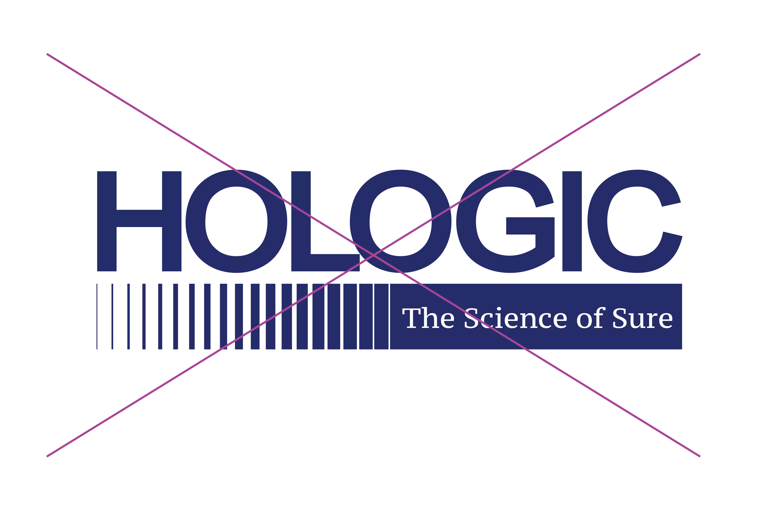
A different type treatment in the progress box
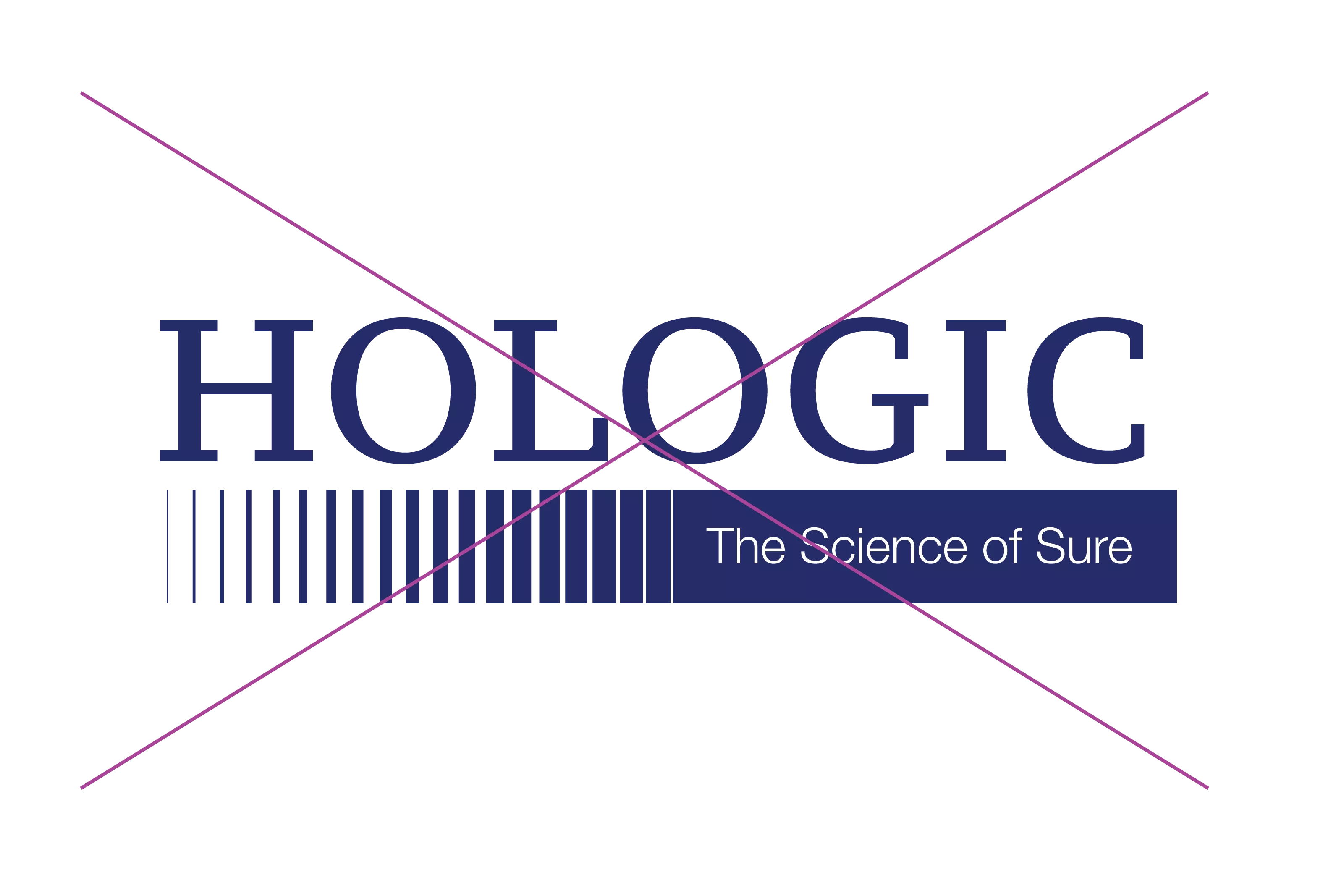
A different type treatment for the logo
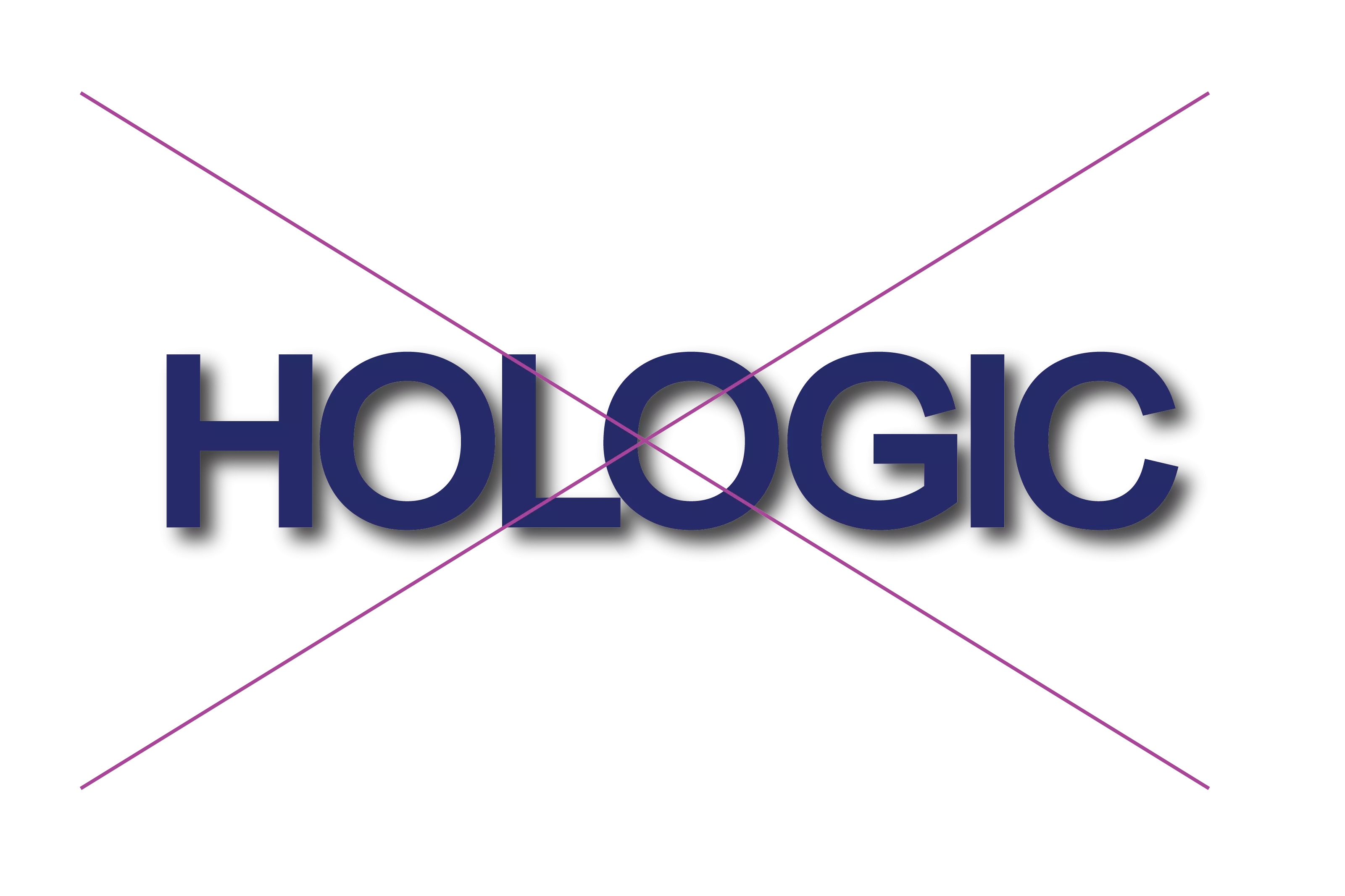
Drop shadow or effect
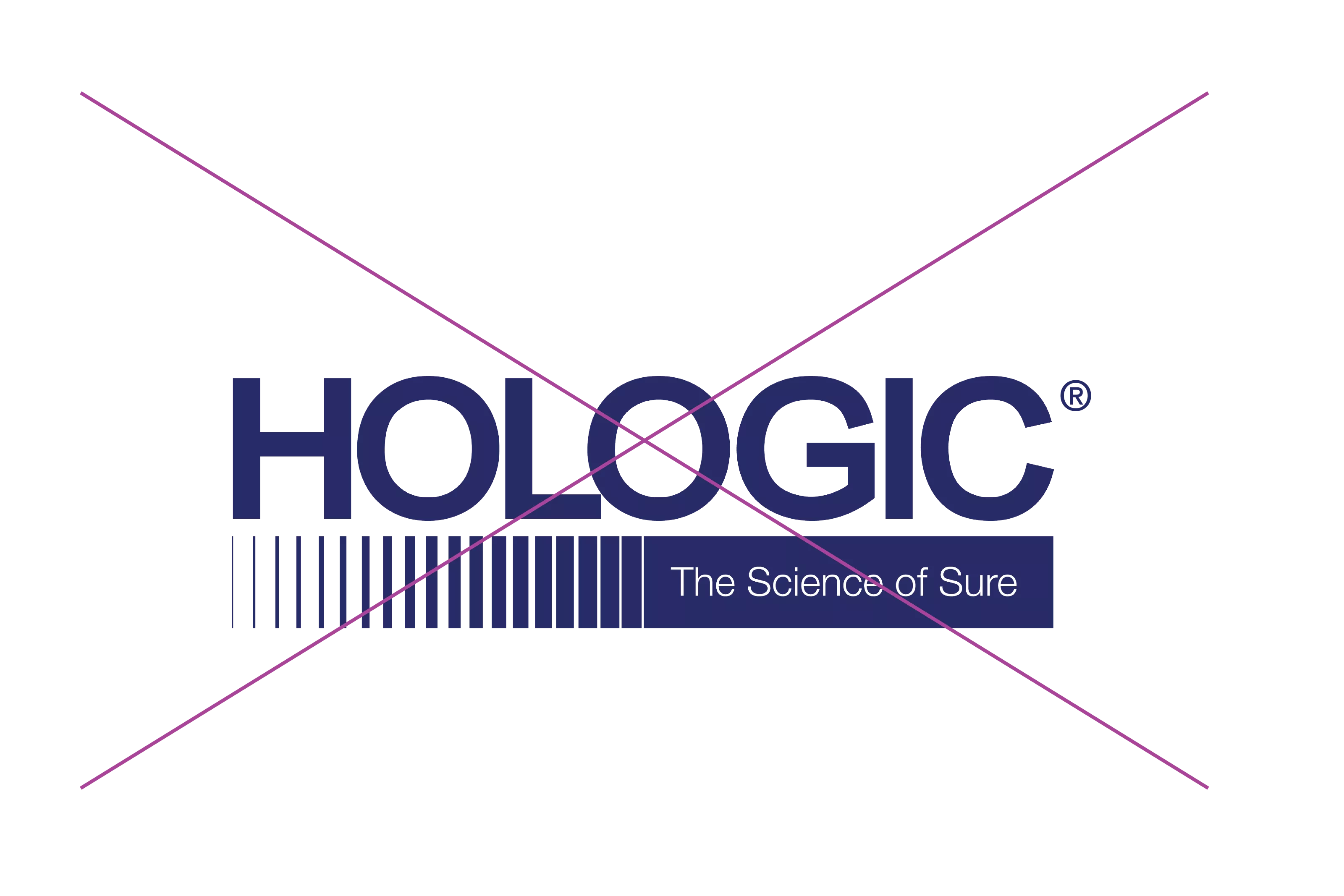
Incorrect trademark use
Without the progress bar, but not in a progress box
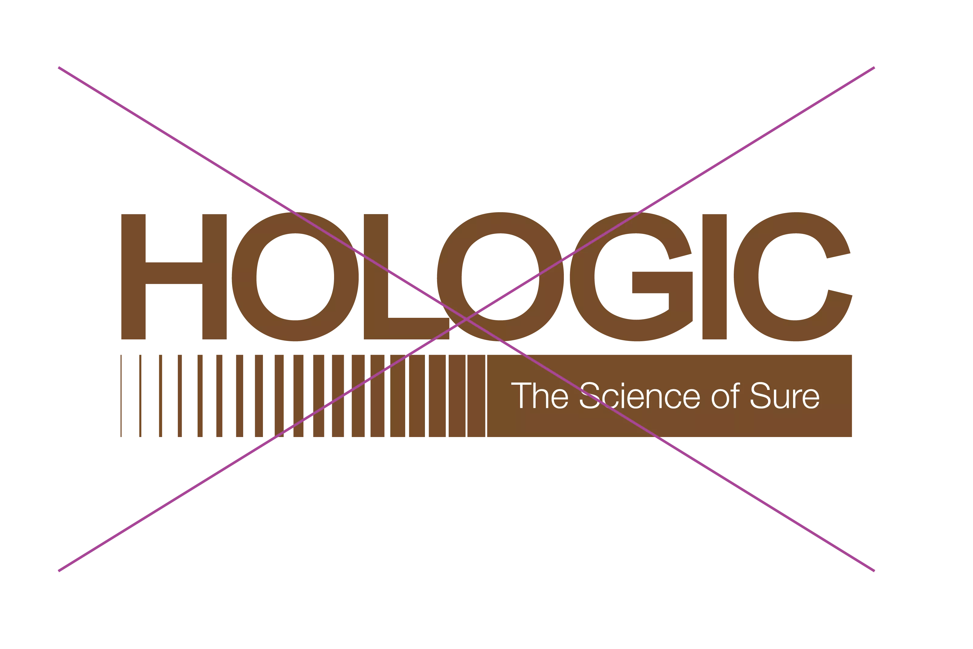
Rendered in a different color
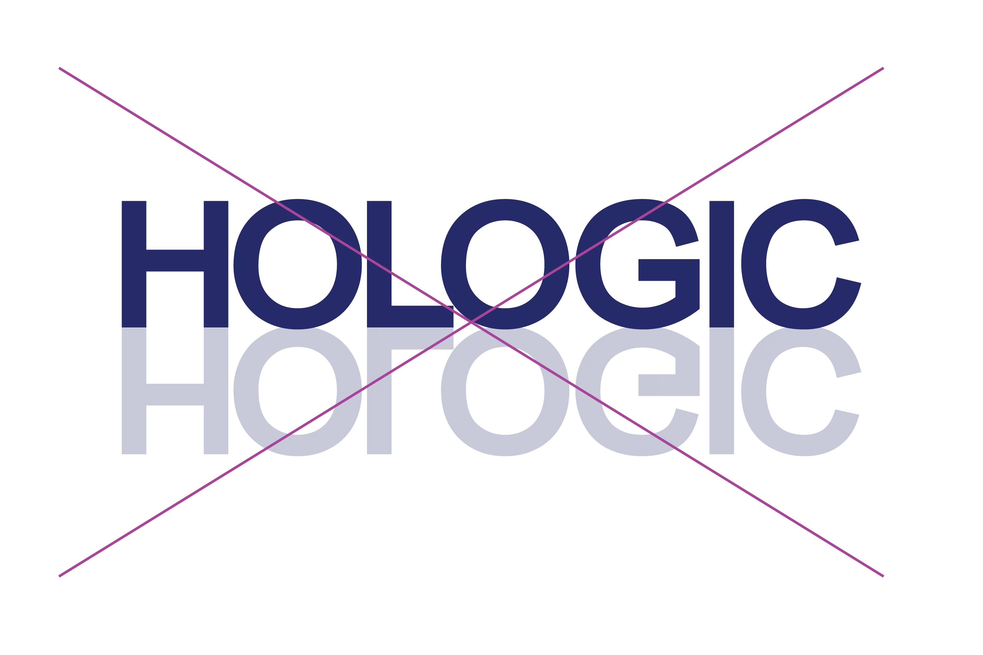
Rendered with a different reflection
Logo Clearance
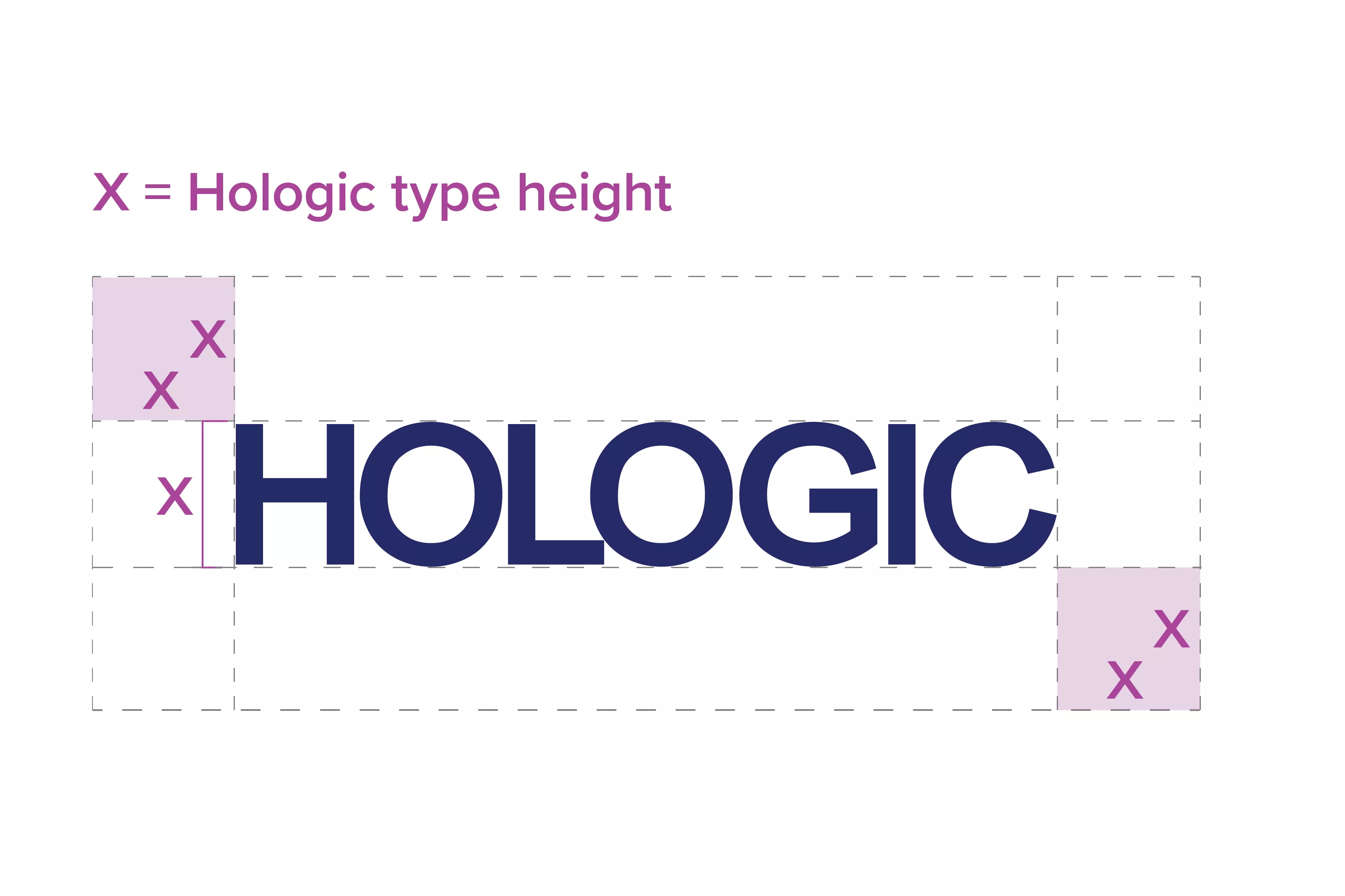
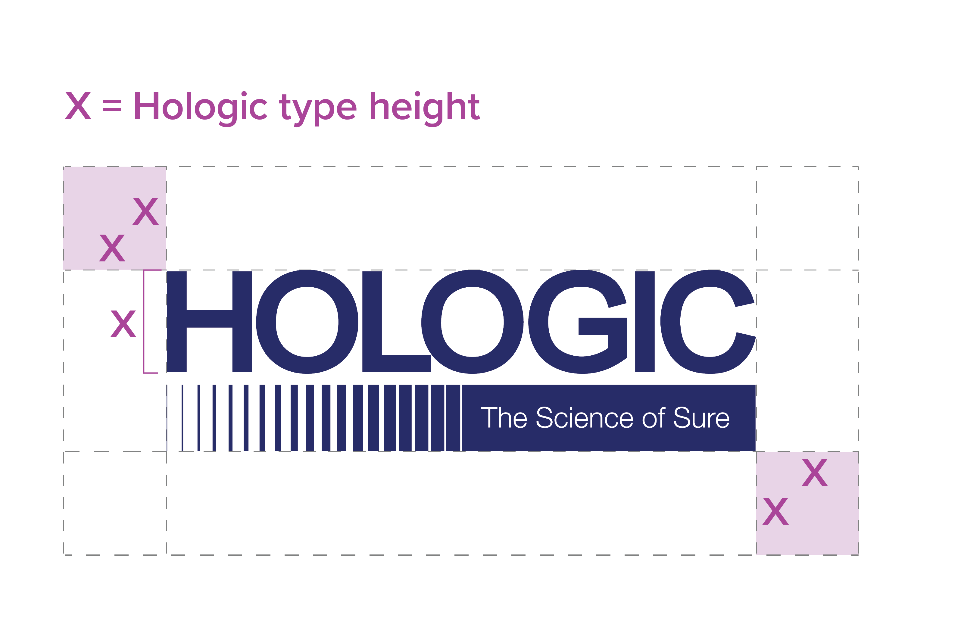
- The Hologic logo should always be surrounded by a minimum area of clear space as shown in this illustration by the X-height.
- The clearance space should also be used to set the minimum distance a logo can be placed from an edge.
- This clearance space is a minimum and should be increased wherever possible.
- The clearance space should be kept clear of visual clutter and other elements.
- Smaller labelling assets are the only exception where the clearance space can be reduced. See labelling guidance
Using Our Two Different Logo Versions
The Hologic logo can be used with and without The Science of Sure tagline. The Hologic logo without a tagline is the primary logo and will be used more frequently. Hologic’s The Science of Sure logo can be appropriate to use, depending on the communication context and target audience. Using either logo is at your discretion. The guidance below will help you make the right decision.
The Primary Logo will be Used the Most
The primary Hologic logo is clean, clear and digital friendly. This logo will be used more frequently than the Hologic Science of Sure logo. The Hologic logo should always carry the ® trademark symbol on products, packaging, and any other product related documentation including labelling and product training documentation. The logo should be used without the ® trademark symbol on marketing materials and digital platforms.
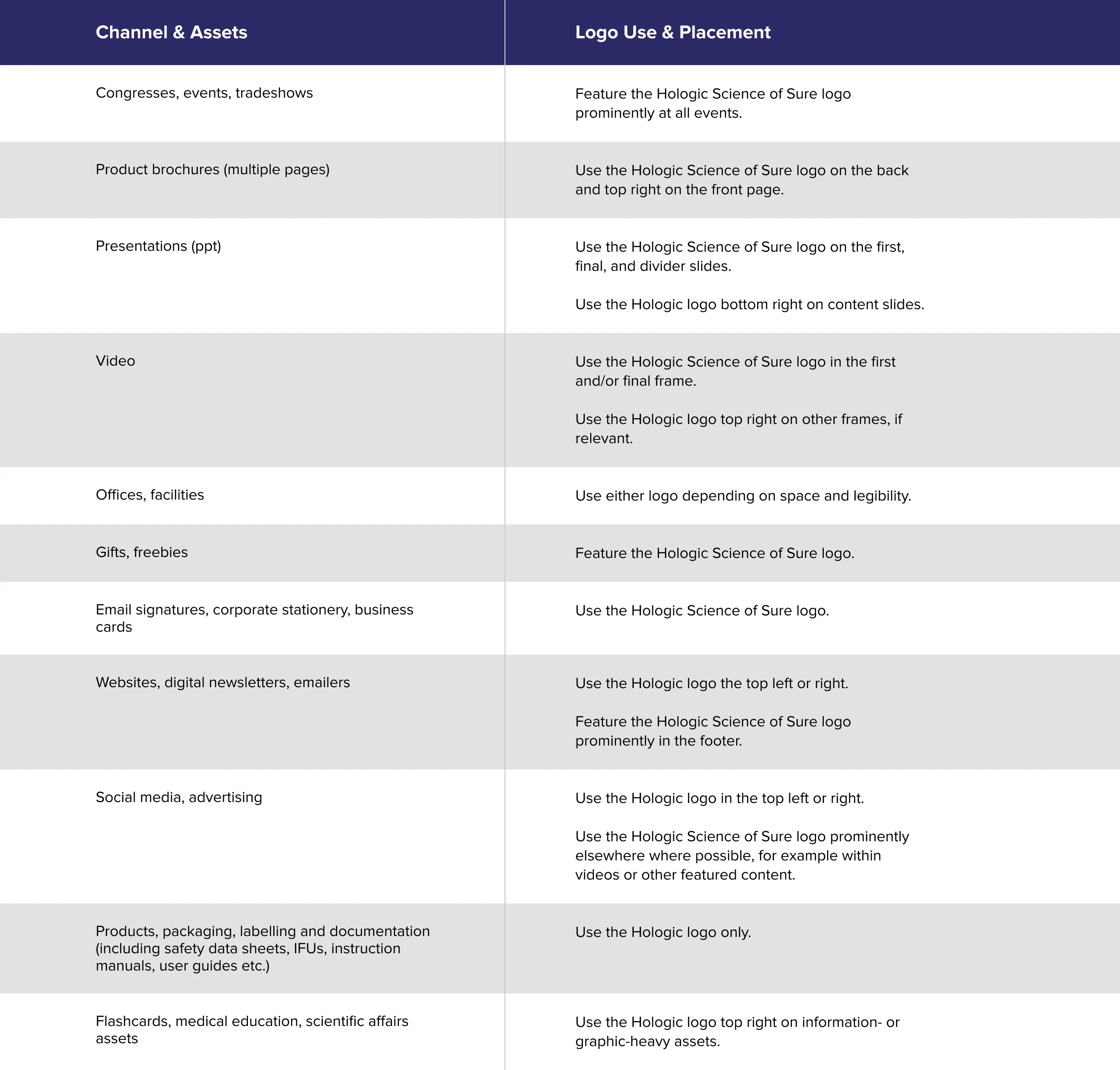
Primary Logo Placement & Channel Use
Having consistent logo placement is important to present a unified Hologic brand. Especially as Hologic assets and collateral can have a long lifespan and are often combined during events or on websites.
The preference is for the Hologic logo to feature top right on assets and collateral. This will help us be consistent in our visual language and make sure assets created at different times work well together. However, there are exceptions to the top right rule, for example on websites and event stands. The guide below will clarify preferred placement of the Hologic logo.
Note, all channels listed below should use the Hologic logo without a ® trademark symbol, apart from on corporate stationery. Existing logos still using the ® trademark symbol incorrectly should be replaced.
The Hologic logo should be placed in the header and footer of websites or web pages as illustrated on this site.
If a video is branded, then the Hologic logo should be used top right. Alternative placement is possible in animations, opening and closing sequences.
The Hologic logo should primarily be used top right unless templates dictate otherwise. In smaller display ad sizes, alternative placements can be used.
The Hologic logo should be used top right on social media posts, banners and backgrounds unless templates dictate otherwise.
The Hologic logo should feature as a stand-alone logo under the user's name and title. Additional signature visuals should not use a Hologic logo.
The Hologic logo should be used top right in the banner of a newsletter.
PowerPoint templates should use the Hologic logo top right or bottom right on a slide.
The Hologic logo should be used top right unless the ad placement makes a top left logo more impactful.
The Hologic logo should be used top right across event collateral such as graphics, posters, roll-up banners, leaflets and stands. Other placement can be used on event furniture or walls, if relevant.
The Hologic logo should be used top right.
The Hologic logo should be used top right on the front cover.
The Hologic logo should be used top right on the front cover. It does not need to be repeated on all pages.
Logo placement may vary depending on the asset format or shape. Lead with the Hologic logo in a top right placement, if possible.
Placement as appropriate to the format and shape.
Top right placement, if relevant. Central alignment can be more appropriate on flags and banners.
Placement as appropriate.
Hologic logo as per letterhead template. [link]
Hologic logo as per stationery templates. [link]
Using the Hologic Science of Sure Logo
The tagline, The Science of Sure, is the Hologic brand promise and position. It is also trademarked as “The Science of Sure” and can never be used with a lowercase “the” or “Science of Sure”.
It’s an important element of our brand. Research shows that The Science of Sure as a tagline is increasing in recall and attribution to Hologic globally. The Purpose, Passion and Promise statement is also highly likable and makes people interested to find out more about Hologic. It is important that Hologic’s The Science of Sure logo has a strong and consistent presence in a corporate context. However, within divisional or product communications, the Hologic logo without a tagline can be the primary logo.
Hologic’s The Science of Sure logo should never use a ® trademark symbol. Existing logos still using the ® trademark symbol should be replaced.
The Right Context for using The Science of Sure Logo
The decision to use Hologic’s The Science of Sure logo should be driven by the communication objectives, context and target audience. Here are 4 key moments where it’s important to use this logo.
Delivering our brand promise
If the main objective is to communicate the Hologic promise or brand position, then it’s key to use the Hologic Science of Sure logo in a prominent way.
Corporate Context
If we are in a corporate setting, then having the The Science of Sure logo present is key. Especially if we are communicating to media, financial audiences and investors.
Building our Brand Internally
Our brand is important for those who work at Hologic. We are the ones who need to embody the brand and believe in what it represents. Using the Hologic Science of Sure logo internally can support this.
To Reinforce our Brand Position
We can use the Hologic Science of Sure as a Signature or a reminder of what we stand for. It doesn’t always need to take the center stage. It can be present at the end of a video, on the final slide of a presentation or on the back of a catalogue. This way we ensure consistency and everyone knows our promise.
Channel Use
When Not to Use Logo
Tagline in Text
Hologic Science of Sure Logo Placement & Channel Use
Using the Hologic Science of Sure logo is at your discretion. However, remember that it’s important to build a stronger Hologic brand wherever possible. The Hologic Science of Sure logo should never use a ® trademark symbol. Existing logos still using the ® trademark symbol should be replaced.
The Hologic Science of Sure logo can be centered and large in the end frame of a video, as a sign-off or signature. We recommend all videos to have this logo in the closing frame. Most videos will eventually be hosted on our websites or YouTube. This should be considered in choosing logos and the size on screen. Using a small version of this logo is not recommended for video.
The final slide of a presentation should ideally use the Hologic Science of Sure logo in a prominent place. It can also be used on other slides if relevant, for example on a title slide. Make sure the size is large enough to ensure sufficient legibility.
The Hologic Science of Sure logo can be used in advertising if it’s a corporate message or relevant to a campaign objective. Make sure the size is large enough to ensure sufficient legibility.
The Hologic Science of Sure logo can have a prominent placement at a stand or event if it’s a relevant context. It should not be repeated excessively on collateral. Make sure the size is large enough to ensure sufficient legibility.
We recommend using the Hologic Science of Sure logo as a sign off on the back cover of multi-page assets and folders. Make sure the size is large enough to ensure sufficient legibility.
The Hologic Science of Sure logo can be used on direct mail assets, if relevant. However, it should not be excessively repeated. Make sure the size is large enough to ensure sufficient legibility.
We can use the Hologic Science of Sure at our facilities and offices or in a corporate context. However, it should not be excessively repeated. It should be large and prominent to not avoid issues with legibility.
When Not to Use the Hologic Science of Sure Logo
We do not recommend using the Hologic Science of Sure logo in digital channels, unless sufficiently large to avoid legibility issues.
Never on flashcards, leaflets and other assets with product focus and large amounts of information.
Never on labelling, compliance documents and safety data sheets.
Never on legal documents, contracts and corporate stationery.
Never on products and packaging.
Using the Science of Sure® Tagline in Text
We can use the ‘Science of Sure®’ tagline as stand-alone text or in a paragraph. The tagline is registered and should use a ® trademark symbol in this context. It only needs to be trademarked ‘once’ if used on more than one occasion within an asset, for example on a website page.
Master Brand Logo Check List
Make sure you answer yes to all the questions in our check list. If you’re not sure, then you can jump straight to the latest guidance for a final check.
Are you using the right Hologic logo?
Are you following the new trademark guidance?
Are you using the latest version of the logo?
Is the logo placement correct?
Is there enough clearance space around the logo?
Are you using an appropriate background color?
Do you have any questions?
Contact BrandManagement@Hologic.com
Note, existing PDF versions of the master brand guidelines are no longer valid.
Last updated 12/24.