Getting Started
Digital Style
Logos and Symbols
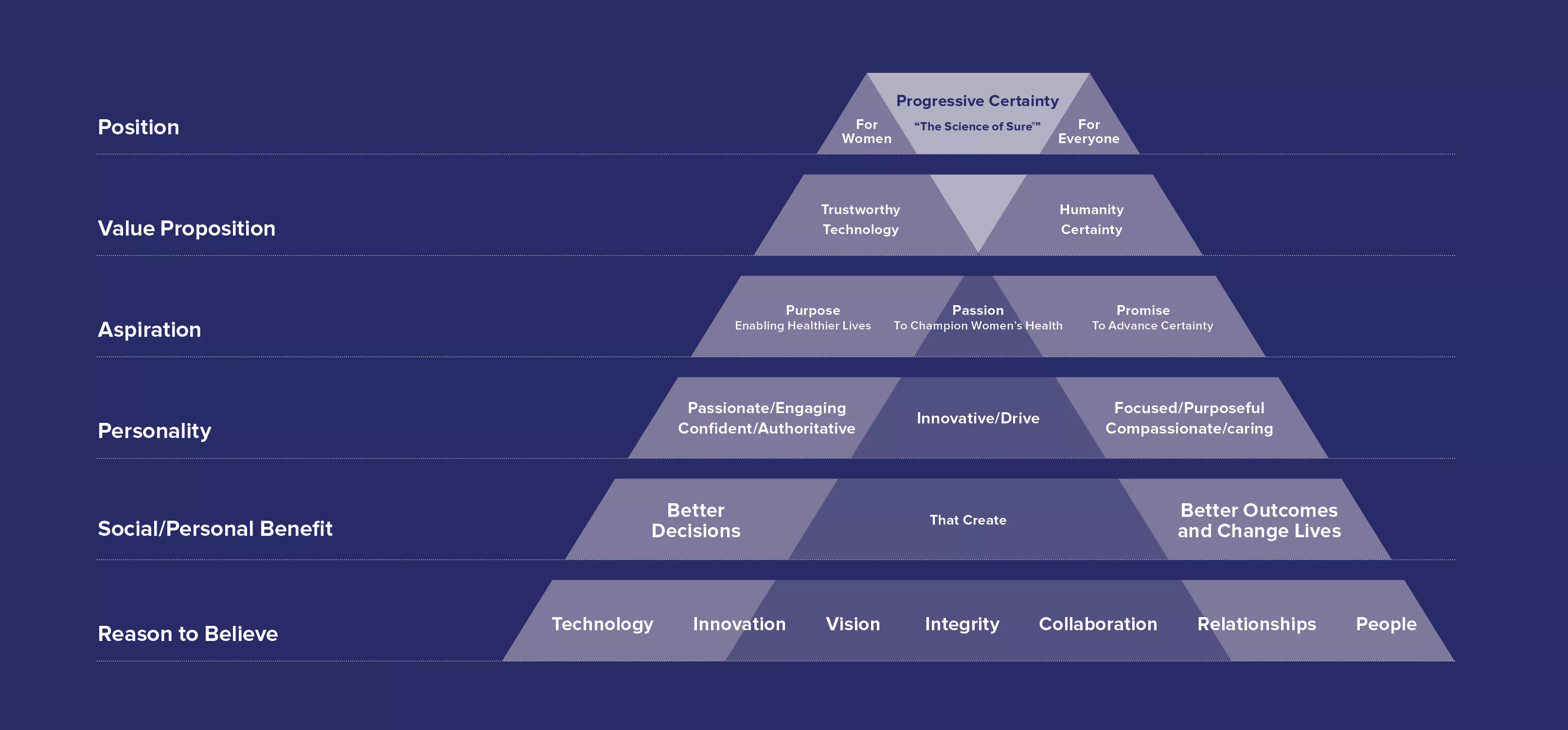
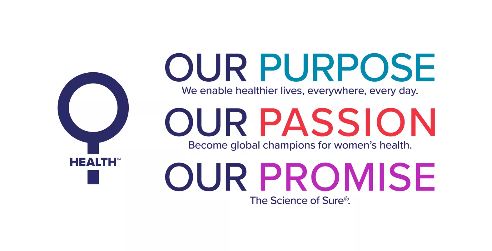
Purpose. Passion. Promise.
Our purpose, passion and promise define the Hologic brand and help us share our unique story in one common, compelling voice. Our story is powered by groundbreaking products that build healthier lives for everyone, though we are especially focused on those that advance women’s health and well-being. As an innovative medical technology company, we offer products that detect, diagnose and treat disease earlier and more accurately than ever.
Our Messaging and Positioning
Positioning
Our Story
Purpose, Passion, Promise
Positioning
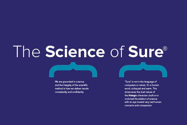
We’re an innovative medical technology company whose brand is driven by our purpose (to enable healthier lives everywhere, every day), our passion (to be the global champions for women’s health) and our promise (The Science of Sure®). By developing products that detect, diagnose and treat disease earlier and more accurately than ever, we are able to build more certainty into patients’ healthcare journey every day.
Our Story
Every brand has a story. Our story is powered by groundbreaking products that build healthier lives for everyone, though we are especially focused on those that advance women’s health and well-being. As an innovative medical technology company, we do this by offering products that detect, diagnose and treat disease earlier and more accurately than ever.
Purpose, passion and promise are the drivers behind everything we do.
Our diverse portfolio of diagnostic tools and technologies gives healthcare professionals the opportunity to detect and diagnose disease and illness and, in turn, offer treatment options earlier, as well as enhance lives with safe, effective aesthetic treatments.
With a heritage of fighting for and discovering new ways to protect women’s health and well-being, we have always been there for patients. We may not be a new company, but we are an evolving, science-driven organization constantly striving to do more for more people.
In fact, our opportunity to have an impact on more people’s lives has never been greater. Today, we address a wide variety of health and well-being challenges, including breast and cervical cancer, osteoporosis, sexually transmitted diseases and abnormal bleeding among others.
Purpose. Passion. Promise.
Our PURPOSE—to enable healthier lives everywhere, every day—is driven by a PASSION to become global champions for women’s health. We succeed by fulfilling our PROMISE to bring The Science of Sure® alive through product quality, clinical differentiation, customer relationships and our team’s talent and engagement.


Integrated Programs

Global Women's Health Index
Information, emotional and epic in its feel and takeaway, is the narrative that frames the story of the Index and its correlation to our purpose — to enable healthier lives everywhere, every day. The literal “why” we created the Index, its purpose is manifest in all we, as doctors, scientists, researchers, and experts work valiantly to achieve.
Find GWHI logo and collateral on Media Valet.
Need to Register? Complete the simple form and your account will be active within 48 hours.

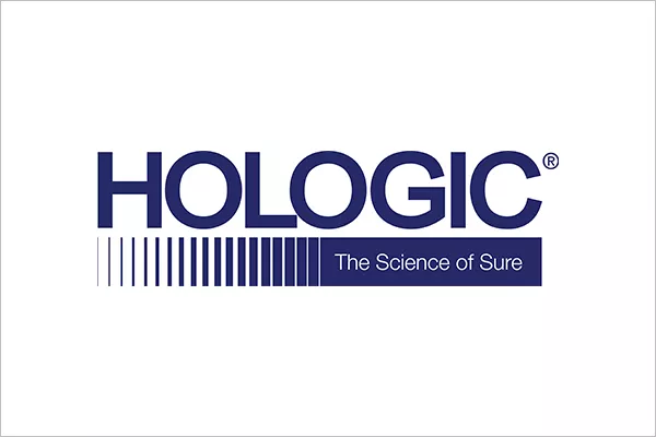
Maintaining the Hologic logotype honors the past, while our tagline embraces the future. In timeless stark blue and white, it supports Hologic’s color palette without overpowering the brand name treatment. To help communicate our commitment to women’s health, we created a special women’s health symbol. Inspired by the traditional universal symbol, our women’s health symbol expands our ability to highlight this commitment.
The rules that follow illustrate when and how to use our logo and symbol across channels and applications.
Our Logo
The Hologic logo should always be expressed in an approved way—in the Hologic blue, with the tagline within the progress bar. All the variations are shown here. The logo should always be at least X distance from any other element.
Bold
Strong lines, classic fonts—timeless stark blue and white
Balanced
Solid foundation sits under the brand
Confident
Legible and recognizable
Challenger
A meaningful part of a real mission
Logo Usage
Acceptable versions
Acceptable inversions
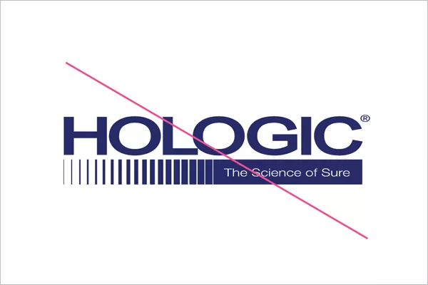
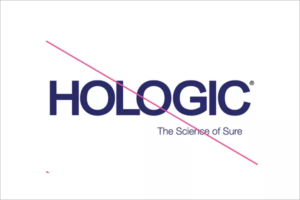
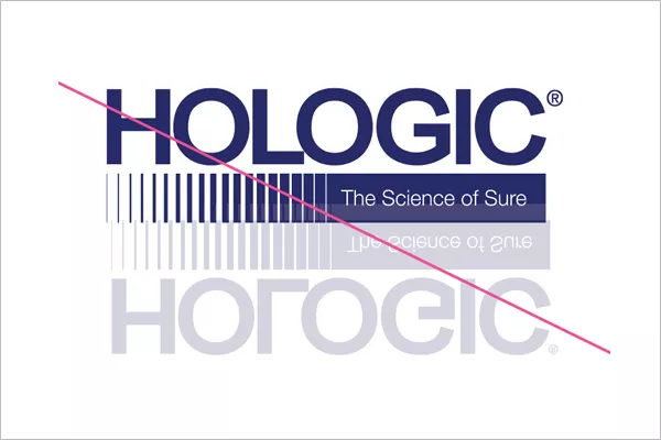
Unacceptable use
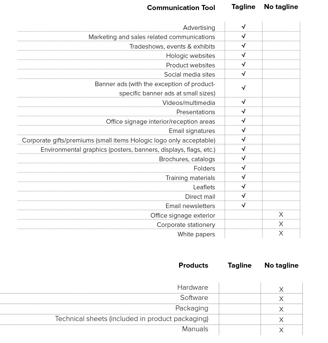
Tagline or no Tagline
Acceptable versions
Hologic_Logo_No_Tagline_PMS2756 blue can be used internally and in places where “The Science of Sure” is already present
Hologic_Main_Logo_PMS2756 can be used for most purposes over a white or extremely light, low-contrast area
Hologic_Main_Logo_Small_PMS2756 for use at sizes between 1 and 1.5 inches
Acceptable inversions
- Hologic_Main_Logo_White against a Hologic blue field
- Hologic_Main_Logo_White against a Hologic gradient
- Hologic_Main_Logo_White over very dense imagery, where the logo itself is completely legible
-
Hologic_Main_Logo_White over a large image, in the area over which doesn't contain any items of high-contrast or interest
Compressed
A different type treatment in the progress box
A different type treatment for the logo
Drop shadow or effect
Stretched
Without the progress bar, but not in a progress box

Rendered in a different color
Rendered with a different reflection
The guide to your right shows whether internal and external assets should use the Hologic logo with The Science of Sure® tagline or without.
Environmental
Also acceptable for large printed sizes
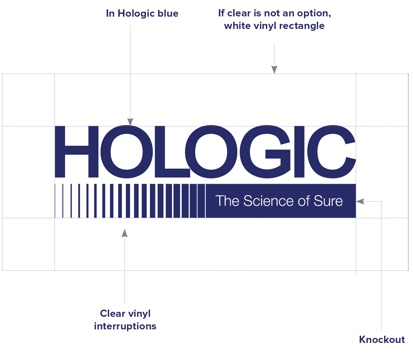
If the logo is printed on vinyl for expression in large environmental settings for interior use, clear vinyl is preferred with the logo printed in Hologic blue. The open areas are to be treated as clear. If clear is not an option, the proportionate rectangle must be cut behind in white.
Please note that in this case, the registration mark is not used.
Also acceptable for large sizes
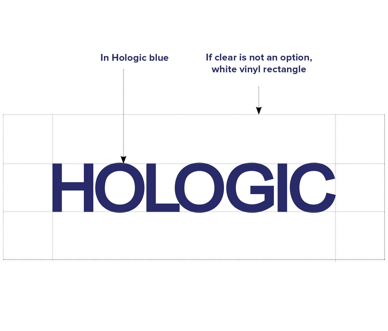
The logo on its own, without the tagline, can be used in large signage for exterior use.
If the logo is printed on vinyl for expression in large environmental settings, clear vinyl is preferred with the logo printed in Hologic blue. The open areas are to be treated as clear. If clear is not an option, the proportionate rectangle must be cut behind in white.
Please note that in this case, the registration mark is not used.
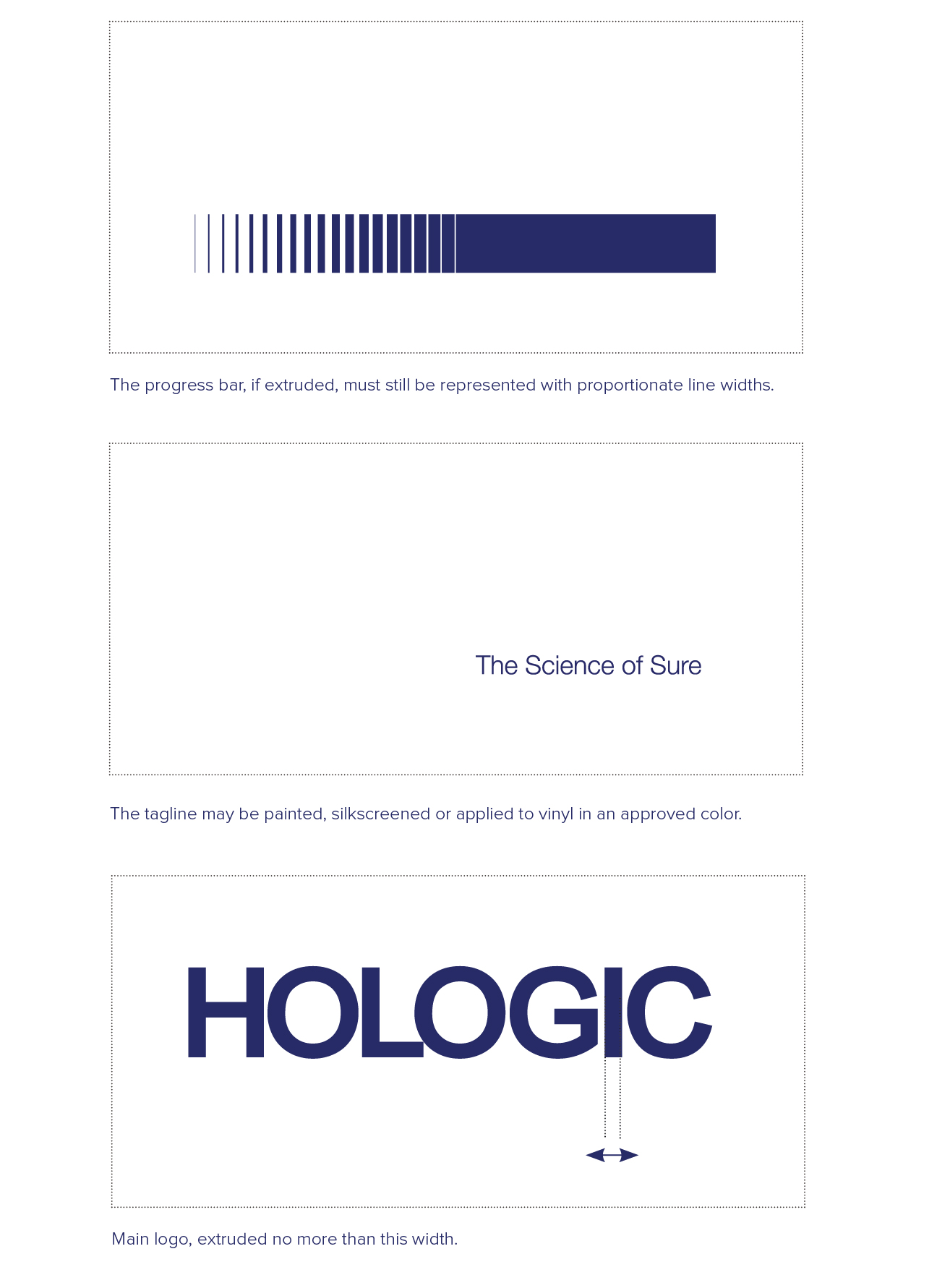
The logo can be extruded at very large sizes for signage and environmental use. The logo may not be extruded more than the width of the letter “I.”
Please note that in this case, the registration mark is not used.
Download Hologic Logo
Legacy logo version in Hologic blue can be used internally and in places where “The Science of Sure” is already present.
Legacy Hologic logo version in white can be used internally and in places where “The Science of Sure” is already present.
Main logo version in Hologic blue can be used for most purposes over a white or extremely light, low-contrast area.
Main logo version in white can be used for most applications over a PMS 2756 blue or over an image where it is an extremely dark, low-contrast area to ensure legibility.
Main logo version in white can be used for most applications over a PMS 2756 blue or over an image where it is an extremely dark, low-contrast area to ensure legibility.
Main logo version in white can be used for most applications over a PMS 2756 blue or over an image where it is an extremely dark, low-contrast area to ensure legibility.
Media Valet is the place to find all of our brand assets.
Need to Register? Complete the simple form and your account will be active within 48 hours.
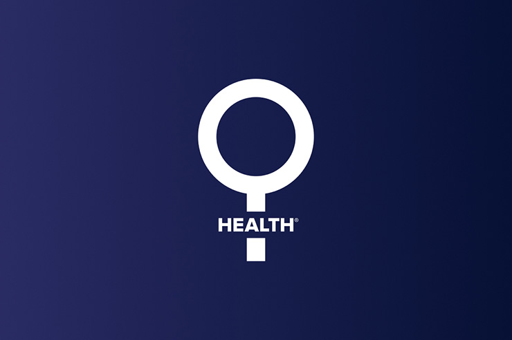
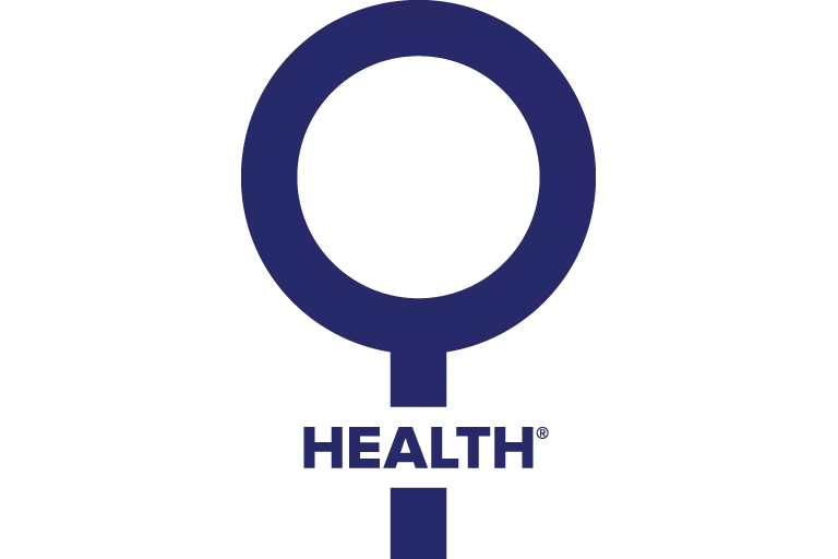
Women's Health Symbol
To help communicate our commitment to women’s health, we created a special women’s health symbol. Inspired by the traditional universal symbol, our women’s health symbol expands our ability to highlight this commitment. The rules that follow illustrate when and how to use the symbol to emphasize our commitment to and support of women’s health, or to visually call attention to a product, service or idea related to women’s health.
Clear Space
This example shows the minimum amount of clear space that must be left blank around the women’s health symbol. Including this space will ensure that the symbol stands out from its background and is easily recognizable.
Clear space must be 75% of the width of the outer edges of the symbol.
Color Usage
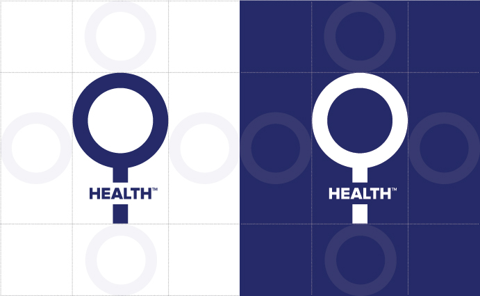
The color specifications shown here indicate how the women’s health symbol is to be treated. Do not deviate from these specifications, as they have been carefully chosen to represent the brand and the emphasis we place on women’s health. The symbol may be used as a knock out of white, overlaying approved brand colors.

PMS 2756 C
C:100;
M:94;
Y:0;
K:20
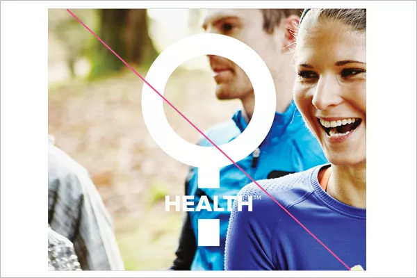
Women's Health Symbol Usage
Acceptable versions
Unacceptable use
Acceptable versions
Proper use of the women’s health symbol effectively highlights our focus on women’s health and differentiates our brand. Shown here are examples of acceptable usage for print, digital and other communications.


Improper use of the women’s health symbol weakens the power of our brand. Shown here are examples of unacceptable usage.

Do not change the color of the women’s health symbol.
Do not place the symbol over a photograph or busy background.
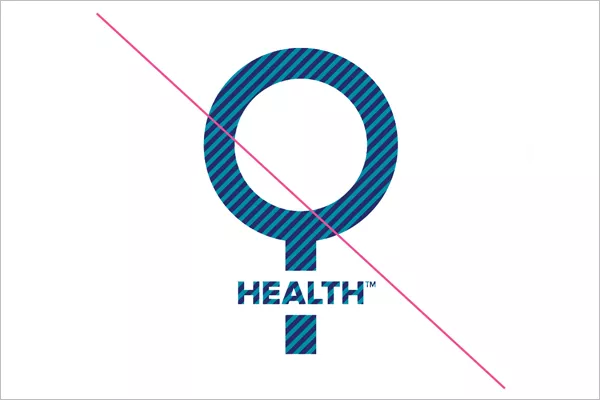
Do not fill the women’s health symbol with a texture or pattern.
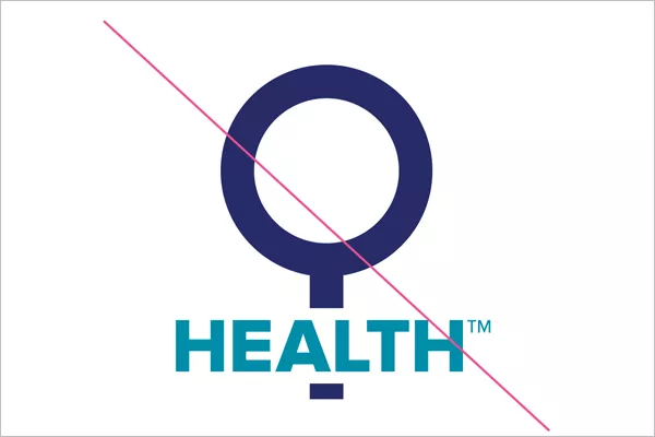
Do not change the size or color of the word HEALTH.
Do not incorporate the Hologic logo into the symbol.
Do not incorporate photography into the symbol.
Download Women's Health Symbol
Our Brand Hierarchy
The corporate way to express the divisions is in a lockup using Proxima Nova Bold as the primary font at the same height as the progress bar. The line separating them descends X distance below to provide balance and weighting to the lockup. This application is for internal use only.
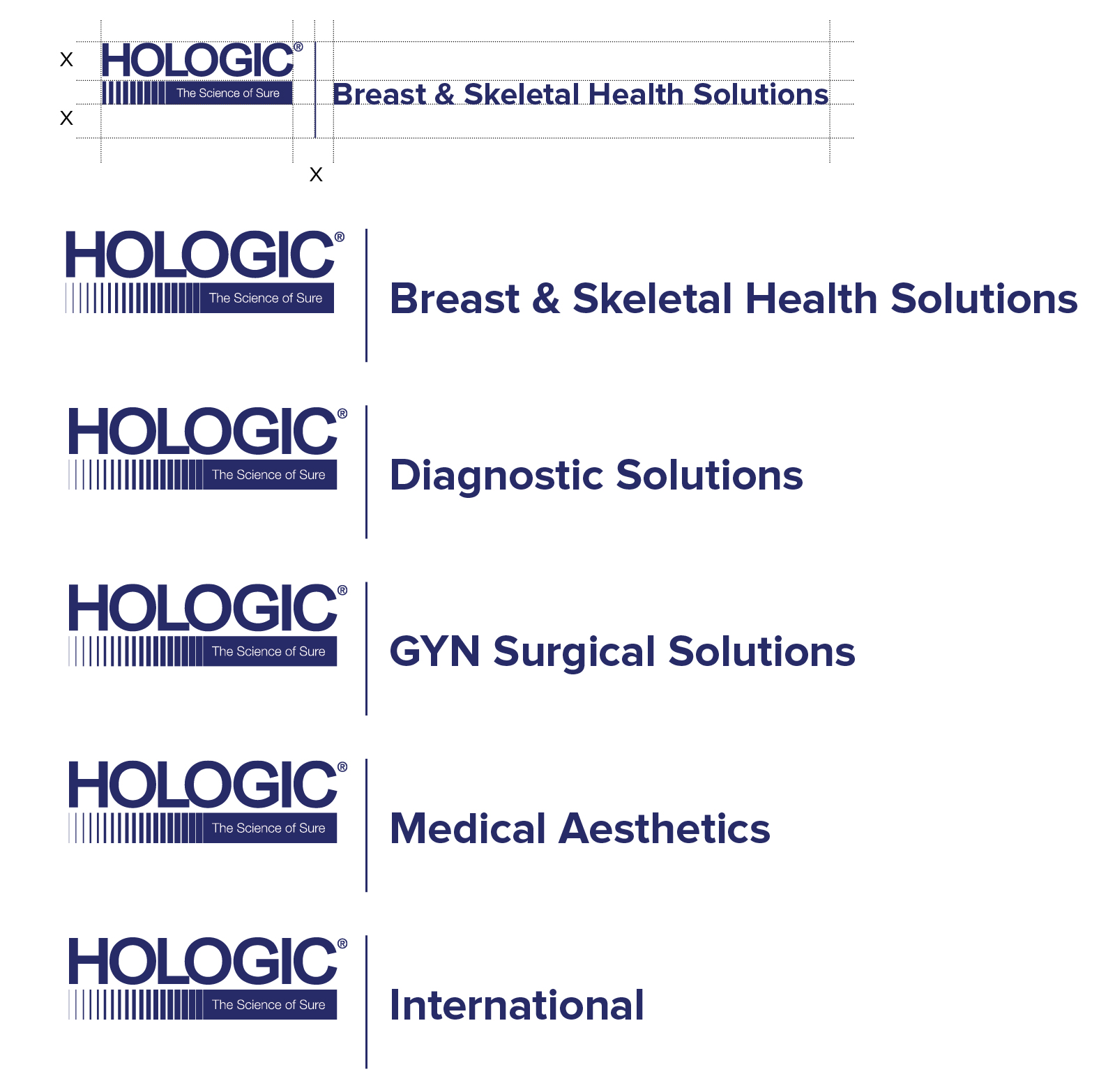
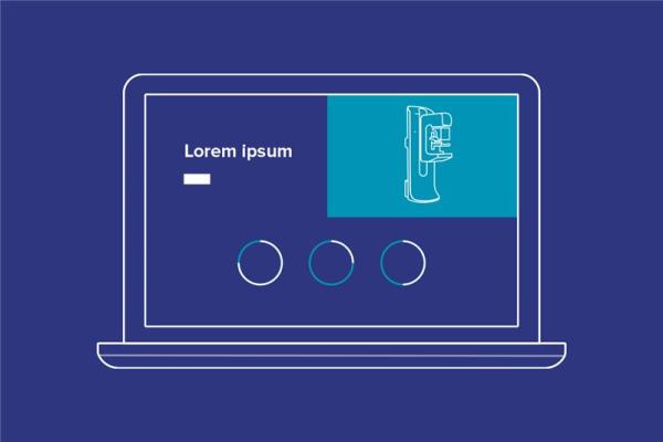
When showing individual departments, use the Hologic logotype without the tagline or progress bar, and the name of the department in Proxima Nova Bold below it at 33% the size of the Hologic logo. If desired, images can be used as squares to accent the department.

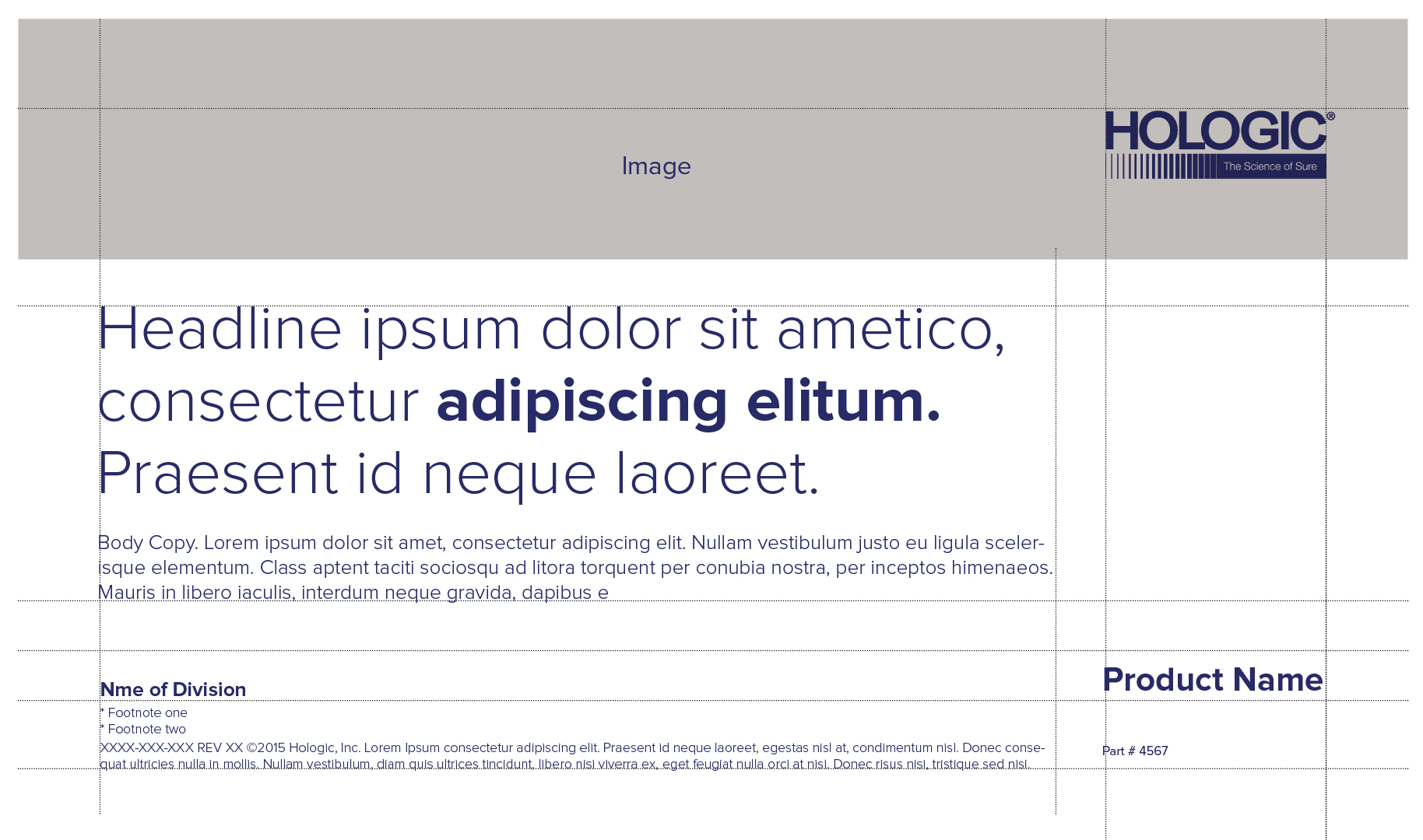
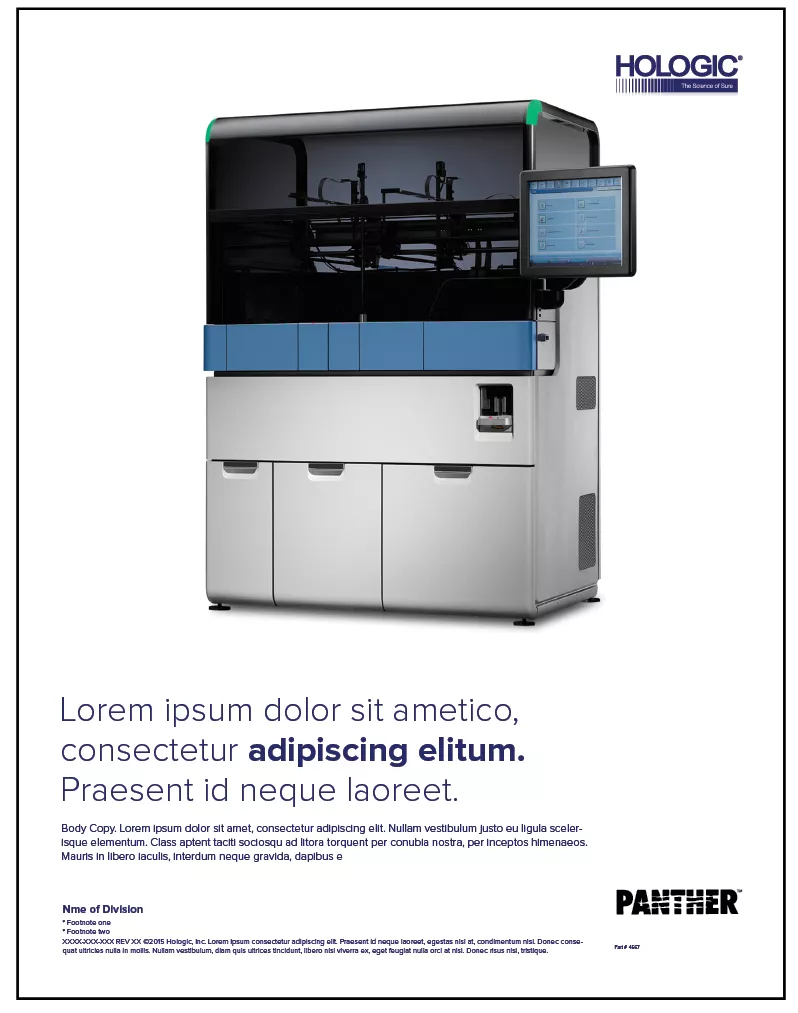
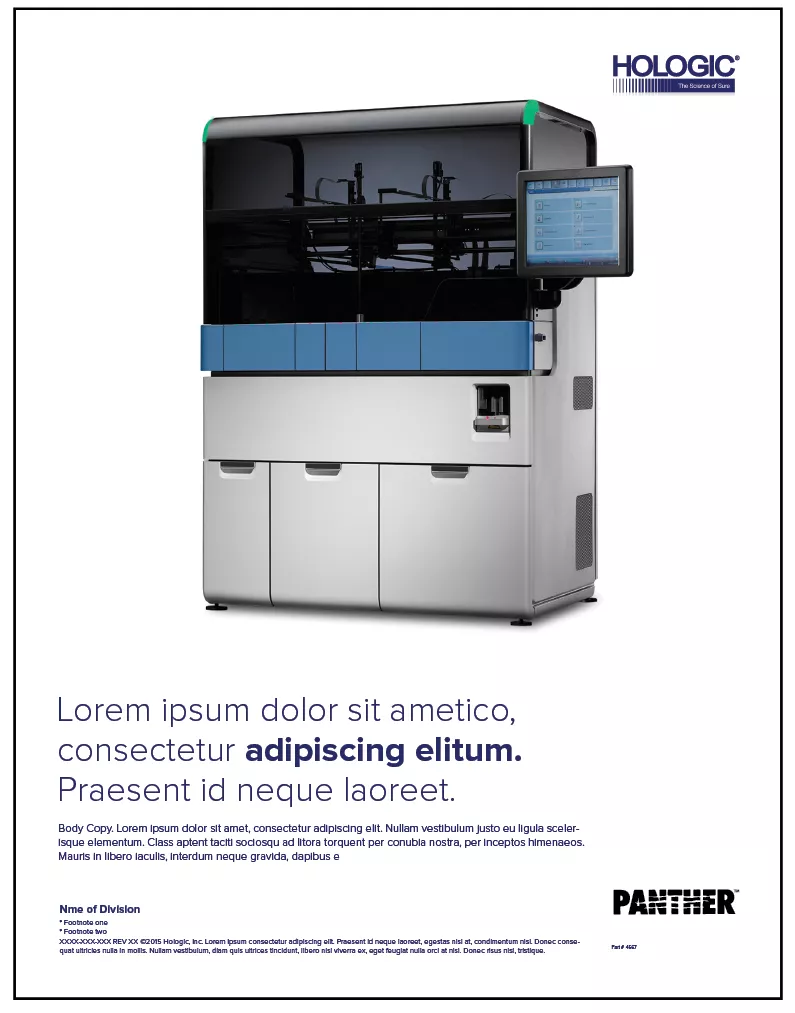
The Hologic brand should always take the lead in our communications about products. The examples here offer guidelines for how the Hologic logo should be placed in relationship to the product brand.